Marketing Content Generator
Redesigned a fragmented AI content platform from research to shipped product — replacing a cluttered one-page setup with a modular, context-aware experience that cut campaign setup time by 40%.
Joining mid-flight — with a mandate to reimagine
When I joined the MCG project at Amex, my first task was to design the UI for early conceptual ideas and wireframes. I used the Amex design system as a foundation and created additional components and patterns tailored to the app's needs — a decision that proved vital as the product evolved well beyond its original scope.
The original concept was overloaded with settings and options. My goal wasn't just to apply a visual layer — it was to reimagine the experience from the ground up, using research as the primary input rather than assumptions baked into the original brief.
Listening first — then designing
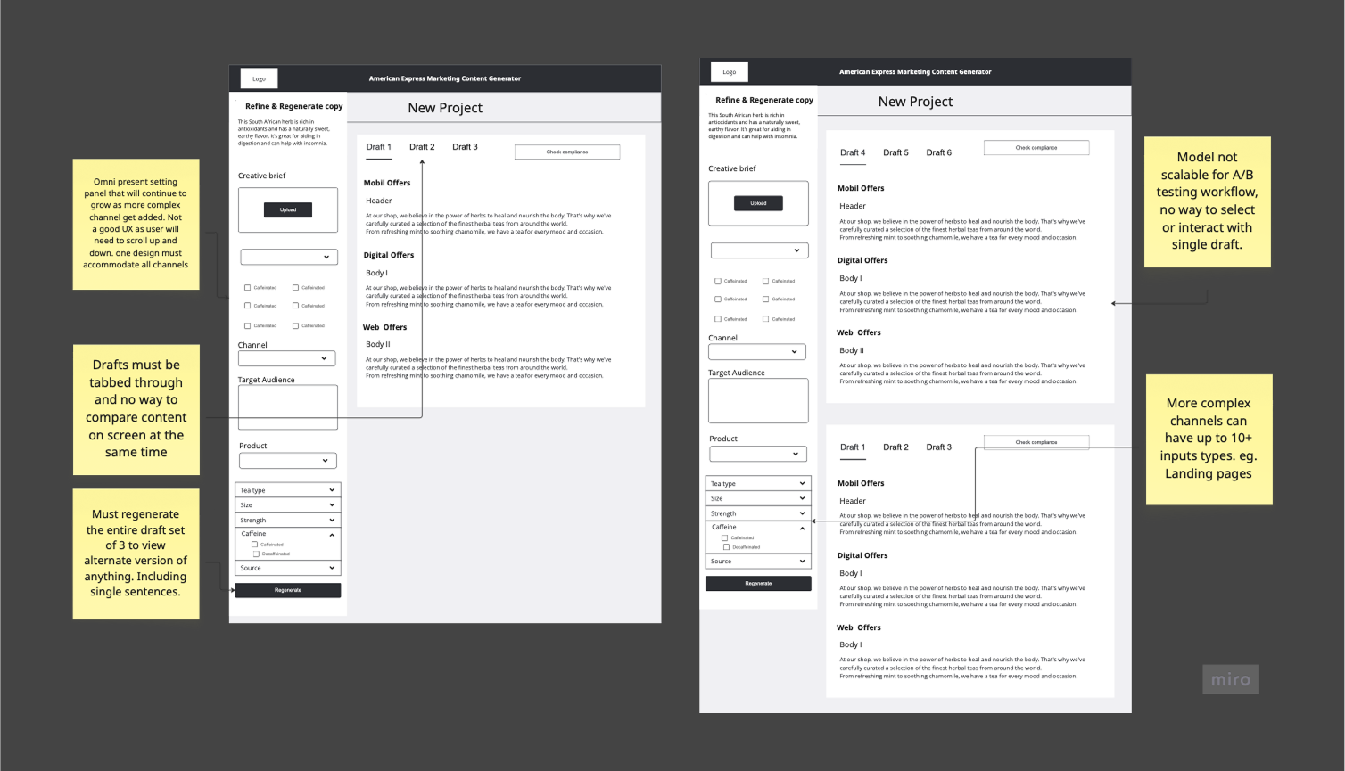
I began by identifying core pain points through stakeholder interviews and moderated user testing. Feedback revealed critical issues: excessive scrolling, misaligned settings, and a layout that didn't reflect how 60% of users actually worked. Rather than iterating on the existing design, the evidence called for a structural rethink.
| Finding | Evidence | Design decision |
|---|---|---|
| 60% of users had different workflows | Interview patterns across 3 user segments | Role-aware, modular setup flow vs. one-size layout |
| Excessive scrolling to reach key settings | Task completion heatmaps, session recordings | Embedded, context-aware controls — no sidebar |
| Settings order didn't match mental model | Think-aloud sessions; confusion peaked at step 2 | Step-by-step setup with channel-conditional branching |
| Low trust in AI output on first use | User sentiment interviews, fear replacement by AI | Inline AI with transparent reasoning + edit-in-place |
From sidebar to embedded — the core UX shift
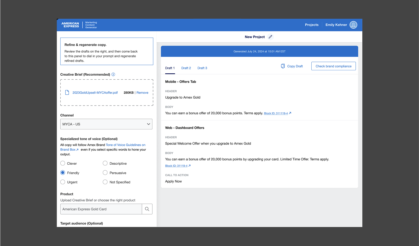
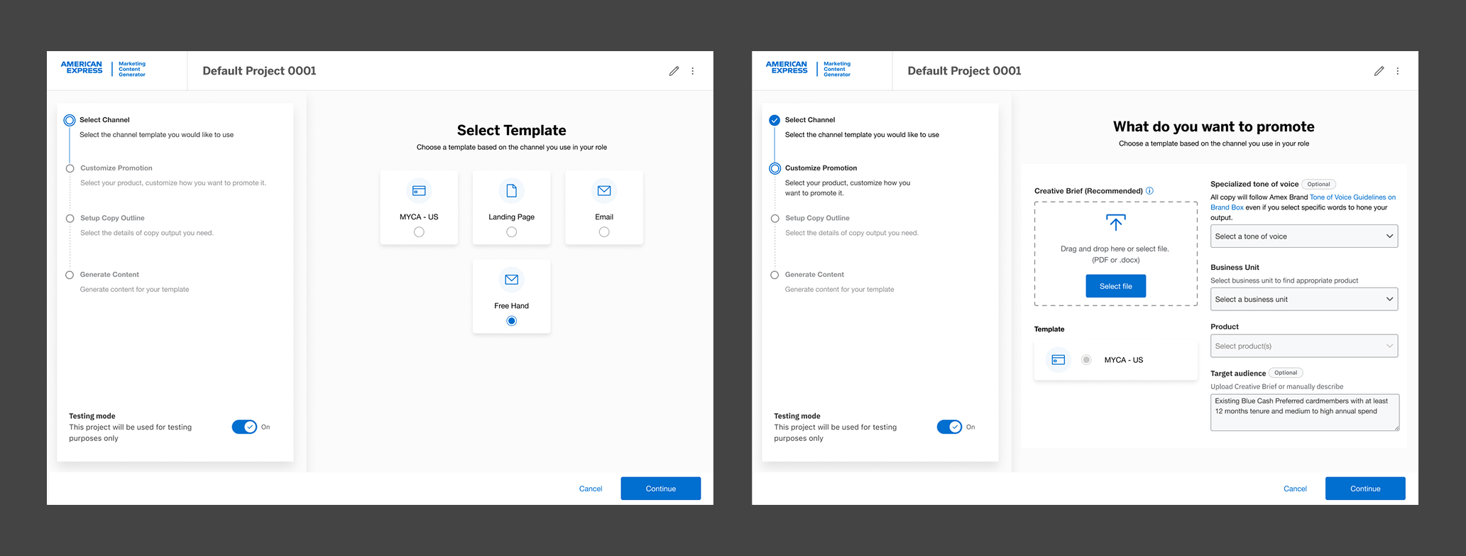
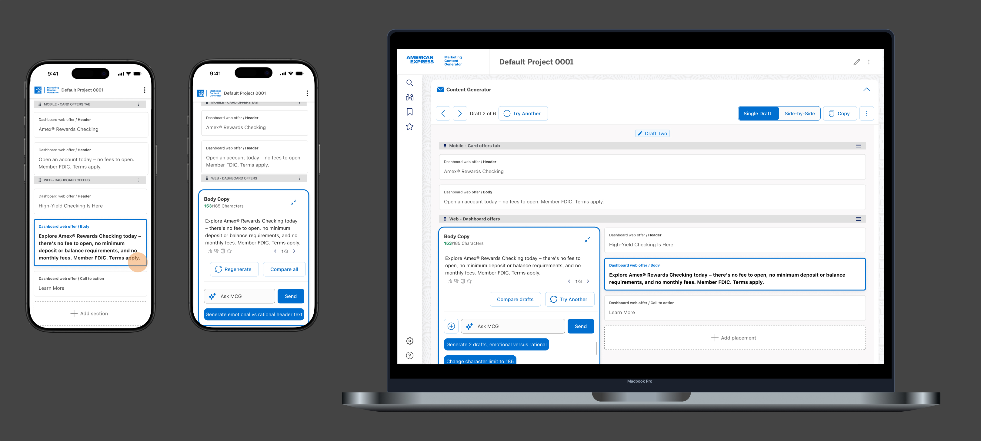
The biggest structural decision was removing the sidebar-based settings panel entirely and embedding controls contextually within the content creation flow. This wasn't aesthetic — it came directly from the research finding that users ignored or misread settings they had to navigate away from the canvas to adjust.
I introduced a modular, step-by-step setup flow that guides users through key decisions without overwhelming them. Each step is purpose-built, with options surfacing conditionally based on selected channel — so a social campaign doesn't surface email-specific settings.
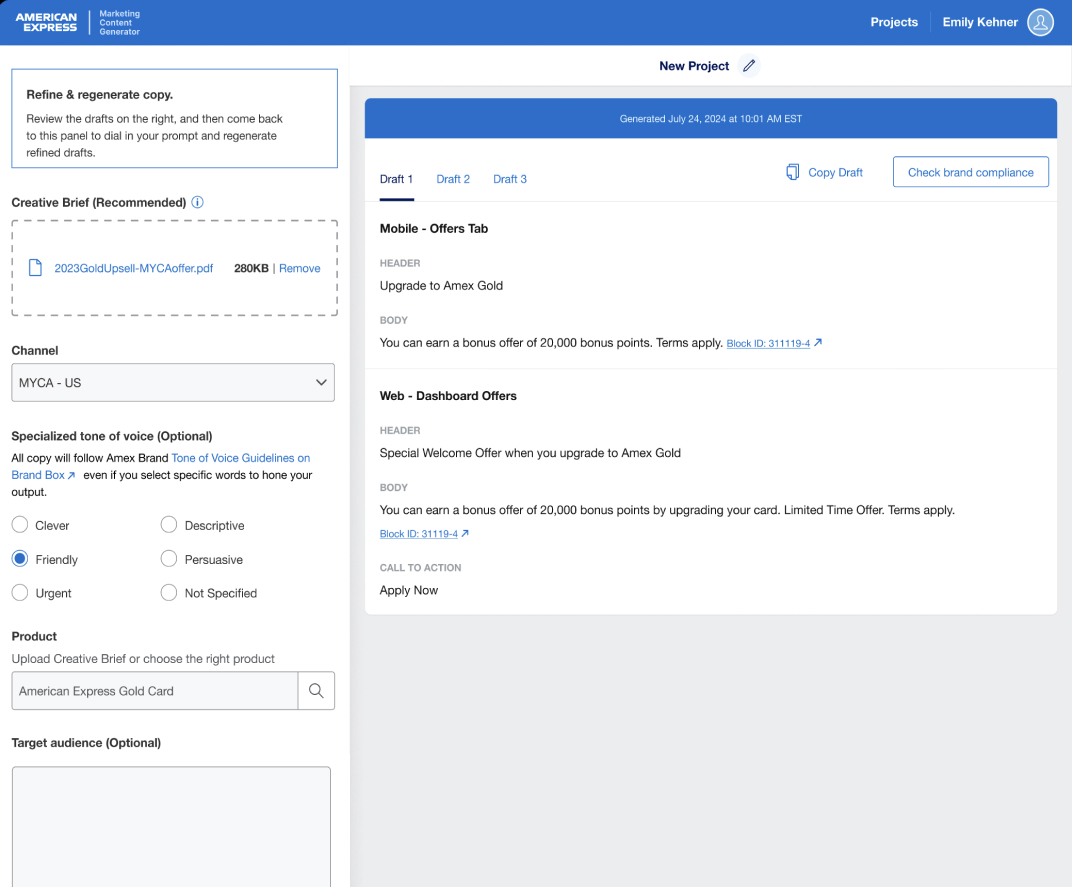
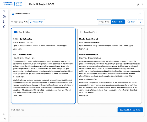
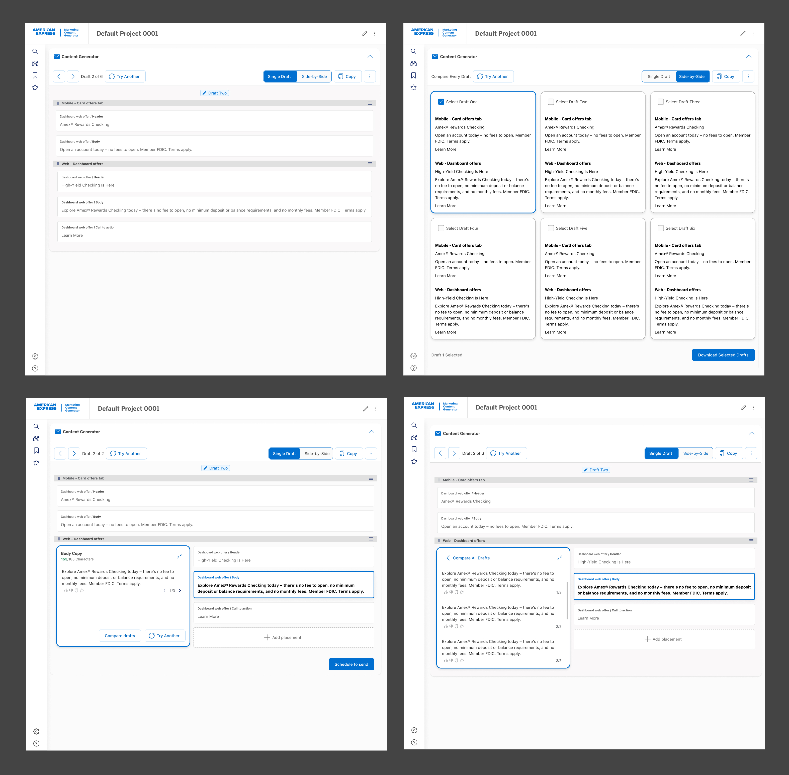
Generative AI embedded in the workflow — not bolted on
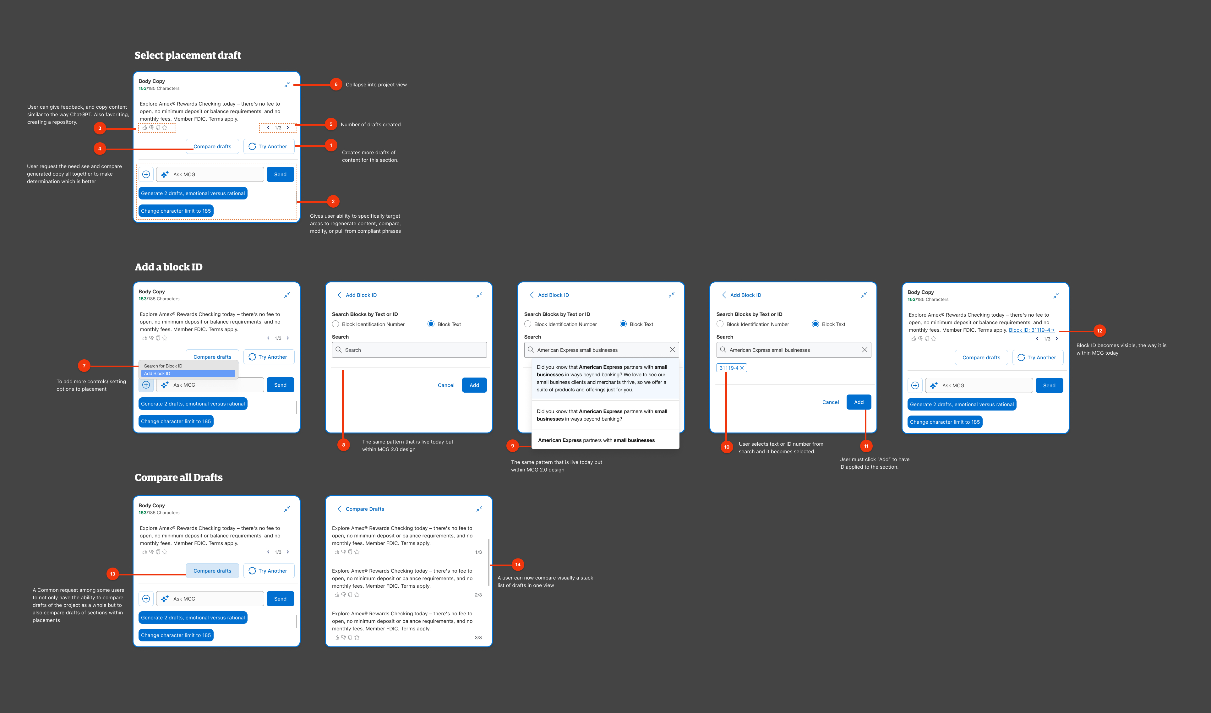
The MCG product used generative AI as its core output engine. My design challenge was making that feel trustworthy and steerable — not like a black box. I designed the AI interaction layer so users could guide generation, review reasoning, and edit outputs inline without ever leaving the creation canvas.
This required inventing new design patterns: streaming output states, confidence indicators, regeneration controls with preserved context, and an edit-in-place model that respected the AI's role while keeping the human clearly in control.
Extending Amex DS — components built to scale
I used the Amex design system as the foundation and extended it with new patterns specific to AI content workflows: a generation panel component, channel-conditional form controls, and an admin role management surface. Each component was architected to accommodate future channel additions without requiring layout rework.
Delivered structured design annotations that clarified component states, interaction logic, and handoff specifications — significantly reducing developer Q&A cycles and keeping the team aligned across a fast-moving build.
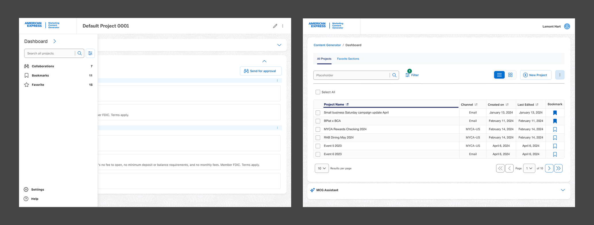
Making past work findable, shareable, and manageable
Beyond the creation flow, I designed a project dashboard aligned to real user mental models — making it easy to locate past campaigns, manage bookmarks and favorites, and support key collaboration tasks like sharing and role-based access.
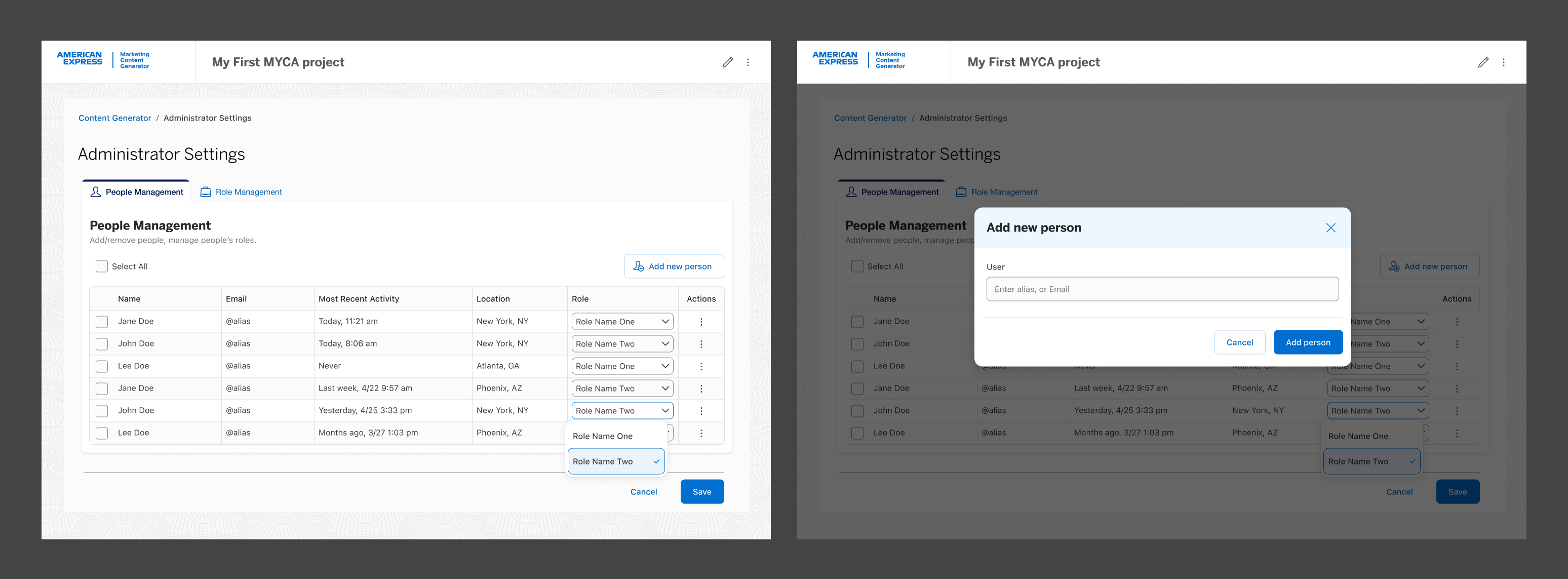
I also designed a dedicated admin settings surface that kept role management separate from the creation flow — giving admins the control they needed without adding complexity for everyday users.
Measurable results from research-backed decisions
Post-launch results showed the redesigned experience not only improved usability but delivered measurable impact across every tracked dimension. The modular setup flow, role-aware UI, and embedded AI interaction model each contributed to a fundamentally faster and more confident user experience.